
SkillCorner Open Data #1: Data Visualization
.


Heading
At SkillCorner, we believe the analytics community moves forward when data is accessible and practical to use. With the SkillCorner Open Data series, our goal is to provide analysts, students and enthusiasts with resources that give them hands-on experience with the same data driving decisions at professional teams.
The series will focus on practical workflows and standard practices used in modern football analytics. Each notebook will demonstrate a specific analytical approach using SkillCorner’s open data.
The first notebook in the series focuses on a data visualization template created with the SkillCorner Viz library. Visualizations are a core part of communicating football insights, and building clean, consistent plots can save analysts a significant amount of time.
This notebook demonstrates how to import the necessary libraries, load the data, normalize metrics, and create your first data visualization. We will be exploring and using Physical Data from the Australian A-League during the 2024/25 season.
1 - Import Relevant Libraries
The first step is to open a Google Colab notebook, which you can do directly from your Google Drive account. Once the notebook is created, run the code block below as your first cell. This will install and import the SkillCorner library so you can access the visualization templates.
In this notebook, we focus on four different chart types from the library, each designed to demonstrate a common visualization pattern used in football analytics.
# Install libraries
!pip install skillcornerviz
!pip install skillcorner
# Import visualizations
from skillcornerviz.standard_plots import bar_plot as bar
from skillcornerviz.standard_plots import scatter_plot as scatter
from skillcornerviz.standard_plots import swarm_violin_plot as svp
from skillcornerviz.standard_plots import radar_plot as rad
2 - Load Physical Data
The next step is to create a dataframe (df) with rows and columns. To do this, we first need to load in the physical data stored in a CSV file in our GitHub open data repository.
There are two ways to access the file. The first is to fork the repository if you are working in a local environment such as VS Code. The second option is to download the CSV file directly into the Google Colab notebook.
For simplicity, we will use the second approach here and load the file directly into the notebook. Copy the code block below, and you have now successfully loaded in your first dataframe of SkillCorner physical data.
# import relevant packages for working with the data
import pandas as pd
import numpy as np
import matplotlib.pyplot as plt
import pandas as pd


url = "https://raw.githubusercontent.com/SkillCorner/opendata/master/data/aggregates/aus1league_physicalaggregates_20242025.csv"
df = pd.read_csv(url)
# visualize the 5 first rows of the dataframe, df
df.head()
3 - Normalization
We are almost ready to start creating the visualizations, but first we need to perform some final normalization and aggregation of the data. The dataset currently contains columns such as total minutes played and raw metric counts at a season level.
To make these metrics comparable across players, we need to normalize them by playing time. This is typically done using per 90 minutes (p90) or per 60 minutes of ball in play time (p60). The p60 approach is possible because the dataset includes minutes played both in and out of possession (TIP/OTIP), allowing us to focus specifically on active game time.
Not all metrics require normalization. Some variables, such as psv-99 (top speed) or time to reach sprint speed, represent peak physical outputs and therefore use the strongest recorded value for each player rather than an accumulated count.
Below are two examples showing how p90 and p60 metrics can be calculated:
# Filter dataframe, df for minimum 5 games
df = df[df['count_match'] >= 5 ]


# Normalizing metrics Per 90
df['hi_count_p90'] = (df['hi_count_full_all'] / df['minutes_full_all']) * 90
df['distance_p90'] = (df['total_distance_full_all'] / df['minutes_full_all']) * 90
# Normalizing metrics Per 60 BIP
df['explosive_accels_to_sprint_p60'] = (df['explacceltosprint_count_full_tip'] + df['explacceltosprint_count_full_otip']) * 60 / (df['minutes_full_tip'] + df['minutes_full_otip'])
# Explore columns/metrics in our dataframe, df
df.columns.unique()
4 - Plotting A Bar Chart
Bar charts are among the most commonly used visualizations in football analytics because of their clear and efficient format. They make it easy to quickly display rankings and compare players based on a specific metric.
The visualization below ranks the top 10 players by PSV-99 across position groups.
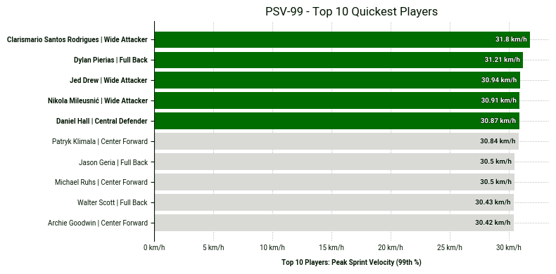
PSV-99 stands for Peak Speed Velocity at the 99th percentile of the speed distribution, specifically considering speeds between 15 km/h and 40 km/h.
PSV-99 is not equivalent to the actual peak speed; it is typically lower than the real peak speed. A high PSV-99 indicates an ability to repeat sprints at high velocity.
Copy the code block below in order to recreate the chart in your own notebook.
# 1. Sort by the metric and take the top 10
# Using 'psv_99' which is the column name
top_10_physical = df.sort_values('psv99', ascending=False).head(10).copy()


# 2. Create the custom plot label (Name | Position)
# This combines the player name and their role for the Y-axis
top_10_physical['plot_label'] = (
   top_10_physical['player_name'] + ' | ' + top_10_physical['position_group']
)


# 3. Automatically get the IDs of the top 5 to highlight them in green
top_5_ids = top_10_physical['player_id'].head(5).tolist()


# 4. Create the bar plot
fig, ax = bar.plot_bar_chart(
   df=top_10_physical,
   metric='psv99',
   label='Top 10 Players: Peak Sprint Velocity (99th %)',
   unit='km/h',
   primary_highlight_group=top_5_ids,   # These 5 will be green
   primary_highlight_color='#006D00',    # SkillCorner Green
   add_bar_values=True,
   data_point_id='player_id',           # Matches the IDs in top_5_ids
   data_point_label='plot_label',       # Uses the 'Name | Position' string
   plot_title='PSV-99 - Top 10 Quickest Players'
)
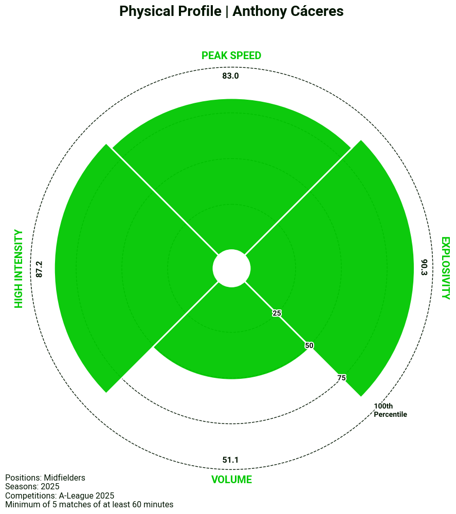
5 - Plotting A Radar Chart
Our visualisation library also includes a template for a radar chart. In this case, we have applied it to our physical data to get a quick summary of a player’s physical profile, but the template can easily be manipulated to display other combinations of metrics.
# 1. Filtering for midfielders
radar_df = df[df['position_group'] == 'Midfield'].copy()

# 2. Creating radar metric categories
PHYSICAL = {
    'hi_count_p90': 'High Intensity',
    'psv99': 'Peak Speed',
    'timetosprint_top3': 'Explosivity',
    'distance_p90': 'Volume'
}

# 3. Create the Percentile Columns
radar_df['hi_count_p90_pct'] = radar_df['hi_count_p90'].rank(pct=True) * 100
radar_df['psv99_pct'] = radar_df['psv99'].rank(pct=True) * 100
radar_df['distance_p90_pct'] = radar_df['distance_p90'].rank(pct=True) * 100

# Invert 'timetosprint_top3' (Lower time = Higher Percentile)
radar_df['timetosprint_top3_pct'] = radar_df['timetosprint_top3'].rank(pct=True, ascending=False) * 100

# 4. Map the percentile values back to the original keys for labels
for metric in PHYSICAL.keys():
    radar_df[metric] = radar_df[f"{metric}_pct"]

# 5. Plot the radar
fig, ax = rad.plot_radar(
    radar_df,
    data_point_id='player_name',
    label="Anthony Cáceres",
    plot_title='Physical Profile | Anthony Cáceres',
    metrics=list(PHYSICAL.keys()),
    metric_labels=PHYSICAL,
    suffix='',

    # Sample text info
    positions='Midfielders',
    matches=5,
    minutes=60,
    competitions='A-League 2025',
    seasons='2025',
    add_sample_info=True
)
Go Further
If you’d like to see additional ways of visualising the data, we encourage you to explore the full Google Colab notebook linked here. The notebook contains the complete code used in this post, along with swarm and scatter plot examples from the SkillCorner Viz Library that you can explore and adapt for your own projects.
We always encourage you to share your work on social media. If you do, please reference SkillCorner as the source of the data and tag our relevant account on X/Twitter or LinkedIn.
In the next installment of the series, we will introduce z-scores and demonstrate how they can be used to standardize metrics and identify statistical outliers in the data.
Stay tuned.


