
SkillCorner Open Data #2: Comparing Players With Z-Scores
.
.png)

Heading
In our first installment of the SkillCorner Open Data Series, we explored how to visualize SkillCorner physical data using bar charts and radars from our viz library, looking at individual metrics like PSV-99 and High-Intensity counts.
But in professional scouting and performance analysis, we often want to answer a broader question: “Who are the most explosive players overall?” or “Which players offer the best combination of work rate and intensity?”
To do that, we need to move beyond single metrics and combine multiple variables into one comparable score. In this post, we introduce z-scores, a statistical tool that allows us to standardise different units and build composite player profiles.
1 - What is a Z-Score?
A Z-score (or standard score) tells us how many standard deviations a data point is from the mean.
- A Z-score of 0 indicates a player performing at the average level.
- A Z-score of +2.0 means the player is significantly above average (top ~2.5% of the league).
- A Z-score of -2.0 indicates significantly below-average performance.
The key advantage of Z-scores is that they allow us to compare fundamentally different metrics on the same scale. For example, Total Distance (measured in metres) and High-Intensity Actions (measured in counts) can be combined meaningfully once they are standardised.
2 - Filtering and Normalization
As in our previous notebook on data visualisation, it is important to start by filtering the dataset you are working with. In this case, we are again using SkillCorner’s open data release from the 2024/25 season of the Australian A-League.
When dealing with physical data, a minimum threshold of five matches is recommended, and you should also define the position group you want to analyse.
In addition, we apply normalisation to the metrics used here, a process explained in more detail in the previous article.
# Filter for players with at least 5 games
df_filtered = df[df['count_match'] >= 5].copy()


# Filter for a specific position group (e.g., Midfield)
# You can change 'Midfield' to 'Center Forward', 'Full Back', etc.
df_filtered = df_filtered[df_filtered['position_group'] == 'Midfield'].copy()


# Per 90 Minutes Example
df_filtered['hi_count_p90'] = (df_filtered['hi_count_full_all'] / df_filtered['minutes_full_all']) * 90
df_filtered['total_dist_p90'] = (df_filtered['total_distance_full_all'] / df_filtered['minutes_full_all']) * 90


# Per 60 Minutes Ball in Play (BIP) Example
# Combining TIP (Team in Possession) and OTIP (Opponent Team In Possession)
df_filtered['hi_count_p60_bip'] = (
   (df_filtered['hi_count_full_tip'] + df_filtered['hi_count_full_otip']) * 60 /
   (df_filtered['minutes_full_tip'] + df_filtered['minutes_full_otip'])
)
We now have a refined dataframe (df_filtered) that includes only midfielders with more than five matches played, along with the relevant normalised metrics. This provides a clean foundation for building composite z-scores in the next section.
3 - Defining The Composite Function
The following Python function automates this process. It groups metrics together, calculates their individual Z-scores, averages them, and then re-normalizes the final result so the composite score itself has a mean of 0 and a standard deviation of 1.
# --- 3. Z-SCORE COMPOSITE FUNCTION ---
def calculate_composite_zscores(df, metrics_group1, metrics_group2, metrics_group3,
                               name_g1='intensity', name_g2='volume', name_g3='explosivity'):
   """
   Calculates composite Z-scores for 3 groups.
   Group 1 & 2: Higher raw values are better.
   Group 3: Lower raw values (Time) are better (Inverted).
   """
   df_result = df.copy()


   # --- GROUP 1
   raw_avg_g1 = ((df[metrics_group1] - df[metrics_group1].mean()) / df[metrics_group1].std()).mean(axis=1)
   # 2. Renormalize the final average so Mean=0 and Std=1
   df_result[name_g1] = (raw_avg_g1 - raw_avg_g1.mean()) / raw_avg_g1.std()


   # --- GROUP 2
   raw_avg_g2 = ((df[metrics_group2] - df[metrics_group2].mean()) / df[metrics_group2].std()).mean(axis=1)
   # 2. Renormalize the final average so Mean=0 and Std=1
   df_result[name_g2] = (raw_avg_g2 - raw_avg_g2.mean()) / raw_avg_g2.std()


   # --- GROUP 3
   z_scores_g3 = (df[metrics_group3] - df[metrics_group3].mean()) / df[metrics_group3].std()
   # 2. Invert them (-1) so lower raw times become high positive scores
   raw_avg_g3 = (-z_scores_g3).mean(axis=1)
   # 3. Renormalize the final average so Mean=0 and Std=1
   df_result[name_g3] = (raw_avg_g3 - raw_avg_g3.mean()) / raw_avg_g3.std()


   return df_result


# --- 4. RUN CALCULATIONS ---
# Defining our groups
intensity_metrics = ['hi_count_p90', 'psv99']
volume_metrics    = ['total_dist_p90', 'hi_count_p60_bip']
explosive_metrics = ['timetohsr_top3', 'timetosprint_top3']


# Change definitions and metrics as you see fit


# Generate the scored dataframe
df_scored = calculate_composite_zscores(
   df_filtered,
   intensity_metrics,
   volume_metrics,
   explosive_metrics,
   name_g1='Intensity_Composite',
   name_g2='Volume_Composite',
   name_g3='Explosivity_Composite'
)
4 - Ranking Players By Metric Category
We have now defined three physical metric groups and calculated Z-scores for each using the function above. In other words, most of the heavy lifting is done, and we can now focus on exploring the results and ranking players across the different groups.
# Preview the top explosive players print
(df_scored[['player_name','Intensity_Composite']].sort_values('Intensity_Composite', ascending=False).head(10))
We can also visualize the top 10 players for intensity with a bar chart from the SkillCorner Viz Library:
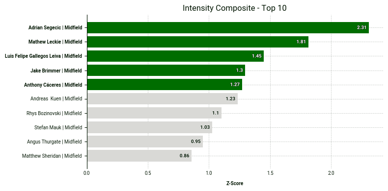
Below is the code to produce it:
# 1. Sort by the composite metric and take the top 10
top_10_physical = df_scored.sort_values('Intensity_Composite', ascending=False).head(10).copy()


# 2. Create the custom plot label (Name | Position)
top_10_physical['plot_label'] = (
   top_10_physical['player_name'] + ' | ' + top_10_physical['position_group']
)


# 3. Get the IDs of the top 5 to highlight them in green
top_5_ids = top_10_physical['player_id'].head(5).tolist()


# 4. Create the bar plot
fig, ax = bar.plot_bar_chart(
   df=top_10_physical,
   metric='Intensity_Composite',
   label='Z-Score',
   primary_highlight_group=top_5_ids,   # These 5 will be green
   primary_highlight_color='#006D00',    # SkillCorner Green
   add_bar_values=True,
   data_point_id='player_id',
   data_point_label='plot_label',
   plot_title='Intensity Composite - Top 10'
)
5 - Plotting A Scatter Plot
Looking at a single metric or metric group in isolation is not always enough to fully understand a player’s profile. This is where scatter plots become especially valuable. By plotting two metric groups against each other, they allow us to assess how players perform across multiple dimensions at once.
This makes it easier to identify players who stand out in both areas, as well as those who emerge as clear outliers. In the scatter plot below, we combine composite z-scores for two key categories: intensity and explosivity.
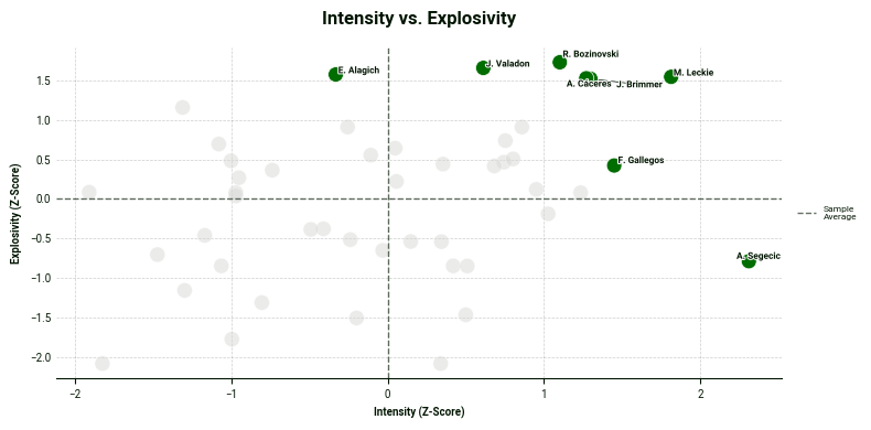
One insight we can draw from this chart is that Adrian Segečić is a standout performer in the intensity category with a z-score above 2. Moreover, the players in the top right corner excels in both categories.
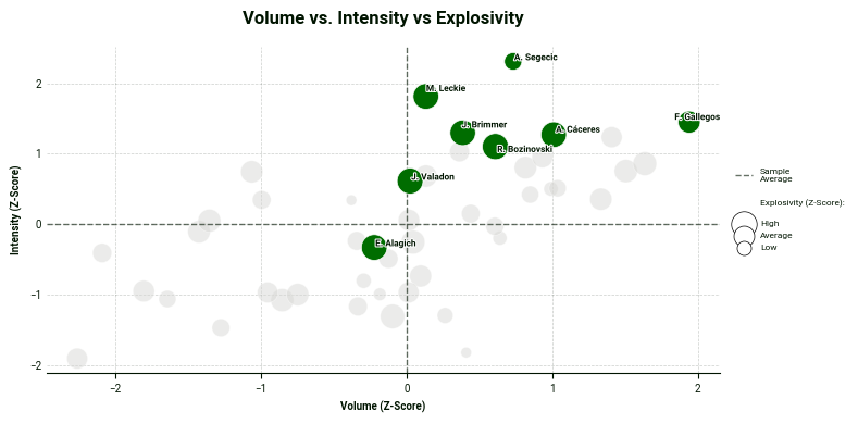
Lastly, we can also add another layer: a third metric group illustrated by adjusting the bubble size in the plot. In this scatter plot, Luis Gallegos leads in the volume category while Matthew Leckie and Anthony Caceres also excel in explosivity - this time illustrated by their bubble sizes.
#  --- 5. SCATTER PLOT USING df_scored ---
# Identify the Top 5 in Intensity and Explosivity to highlight and contrast them with volume using the bubble size.
top_5_intensity_ids = df_scored.sort_values('Intensity_Composite', ascending=False).head(5)['player_id'].tolist()
top_5_explosive_ids = df_scored.sort_values('Explosivity_Composite', ascending=False).head(5)['player_id'].tolist()


highlight_players = list(set(top_5_intensity_ids + top_5_explosive_ids))


fig, ax = scatter.plot_scatter(
   df=df_scored,
   x_metric='Volume_Composite',
   y_metric='Intensity_Composite',
   z_metric='Explosivity_Composite',
   data_point_id='player_id',
   primary_highlight_group=highlight_players,
   data_point_label='player_short_name',
   x_label='Volume (Z-Score)',
   y_label='Intensity (Z-Score)',
   z_label='Explosivity (Z-Score)',


   primary_highlight_color='#006D00',
   plot_title='Volume vs. Intensity vs Explosivity')
6 - Go Further
If you’d like to explore these composite models further, you can find the full logic and scatter plot templates in our Google Colab notebook linked here. Feel free to adapt the functions to build your own physical profiles
We always encourage you to share your work on social media. If you do, please reference SkillCorner as the source of the data and tag our relevant account on X/Twitter or LinkedIn.
In this installment, we’ve shown how Z-scores can standardise different types of metrics and help surface true outliers. But physical output is only part of the picture.
In the next post, we move beyond athleticism and into tactical context. We will show how to combine physical data with Game Intelligence metrics such as off-ball runs to build more complete and actionable player profiles.
Stay tuned.
.png)
.png)
.png)